

Rethinking a professional app to boost retention and attract new users
I led the redesign of LumApps’ mobile apps. By interviewing 50 users, we defined one clear persona and built a unified, feed-first app with a dedicated mobile design system. This shifted LumApps’ mobile strategy from fragmented tools to a coherent, user-centered product.
LumApps is a white-label collaborative intranet designed primarily for desk workers, enabling both top-down communication (from leadership to employees) and peer-to-peer communication. The existing mobile app was an extension of the web platform but was underused by the entire user base - desk workers.
To address frontline workers, a second mobile application was developed.
One of the strategic goals was to consolidate the mobile experience by eventually maintaining a single app serving both user segments, rather than two separate apps.
The existing apps were largely underused by users across the board, but accessibility was actually a strength of the mobile experience rather than a pain point. The main issue lay in fragmented features and inconsistent experiences between the two apps.
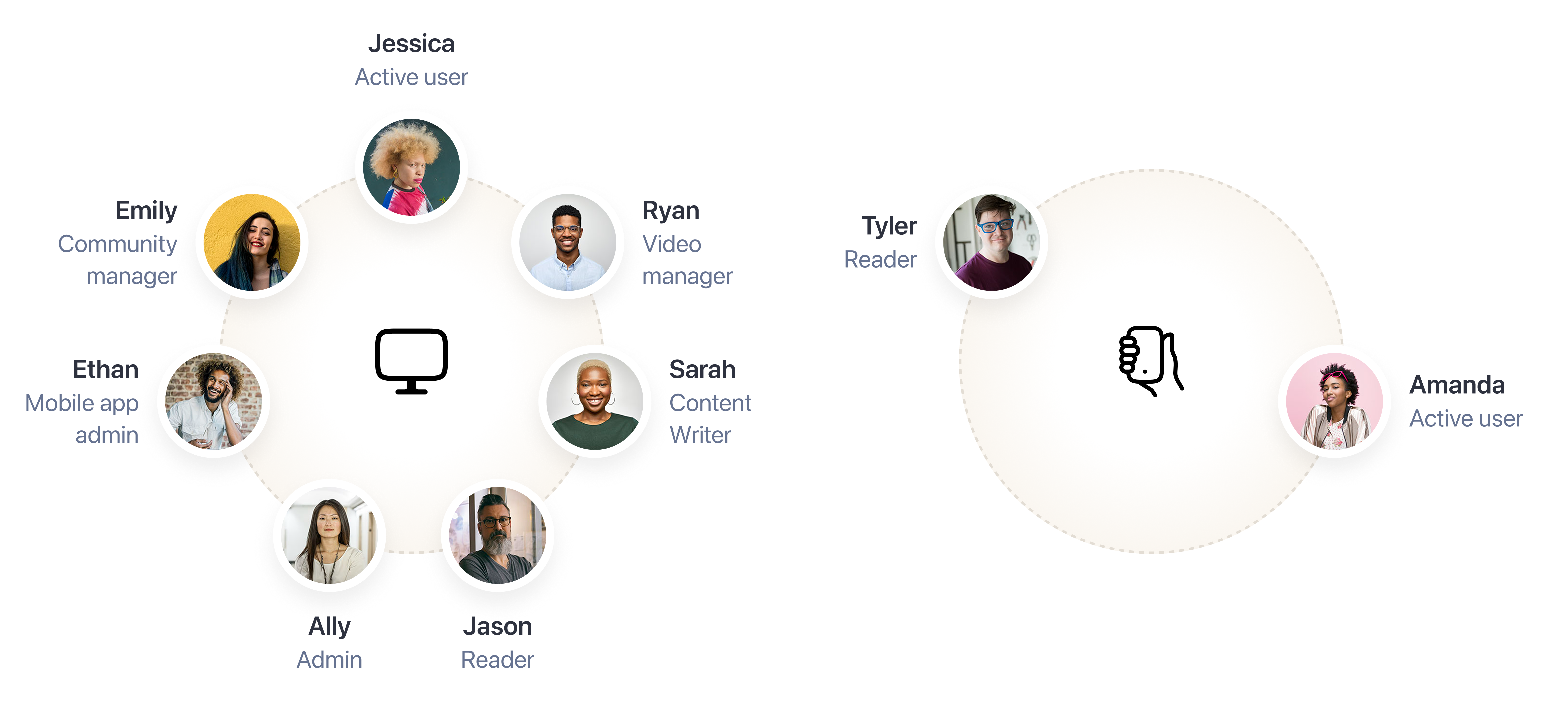
We lacked clear insights into user expectations and usage patterns, especially among frontline workers who operate under different constraints than desk employees.
We needed to:
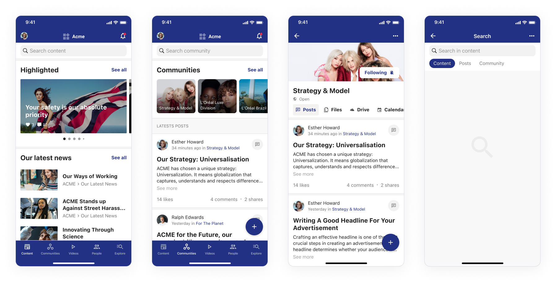
Redesign the mobile application, optimized for blue-collar workers and mobile-first use cases. This meant:
We conducted in-depth interviews with users and non-users of the current mobile app. The participants represented a variety of countries, roles, and use cases to ensure we captured a comprehensive view of needs.
Key findings:
As the design lead, I collaborated closely with the PM, mobile PO, and the UX researcher. We ran collaborative workshops with Android and iOS developers to align early on technical feasibility and constraints.
The design focused on:
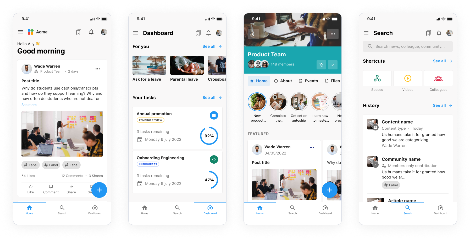
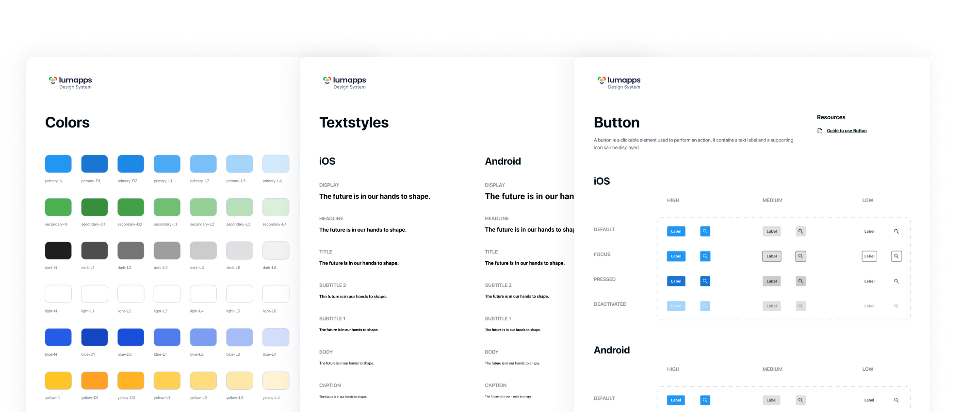
A core objective of the project was to develop a mobile Design System that would bring consistency and scalability across platforms. Until then, mobile apps relied heavily on native OS components visually adapted to mimic web styles, which led to inconsistencies and duplicated effort.
I partnered with the web Design System lead and organized weekly syncs with the Android and iOS leads. We started by standardizing color palettes and typography before prioritizing components based on project needs and designer requests.
All components were designed in Figma and documented in Storybook, complete with usage guidelines and best practices. This initiative greatly improved design consistency and accelerated development, with an estimated 95% reduction in development time for reusable components. The mobile Design System was subsequently adopted by other projects across the company.
We conducted an initial testing round by splitting participants into two groups: one tested prototype A first then B, while the other started with B before moving to A. This rotation helped minimize order bias (primacy effect), which can skew preference toward the first option shown.
The expected outcome was a balanced mix of the two versions. We then ran a second round on prototype C, which resolved the last open questions and confirmed the relevance of a unified feed along with lightweight interaction patterns.
Final high-fidelity mockups were delivered and validated by the mobile teams. Due to my departure, I was not involved in the final internal presentation or development follow-up.
A mobile application concept designed specifically for frontline workers, with:
The project laid the foundation for LumApps’ mobile strategy for non-desk workers. It shifted the internal perception of mobile from an extension of the desktop to a standalone product with its own logic and purpose.
@2025
Designed with ❤️ in Lyon, France


